The Concept
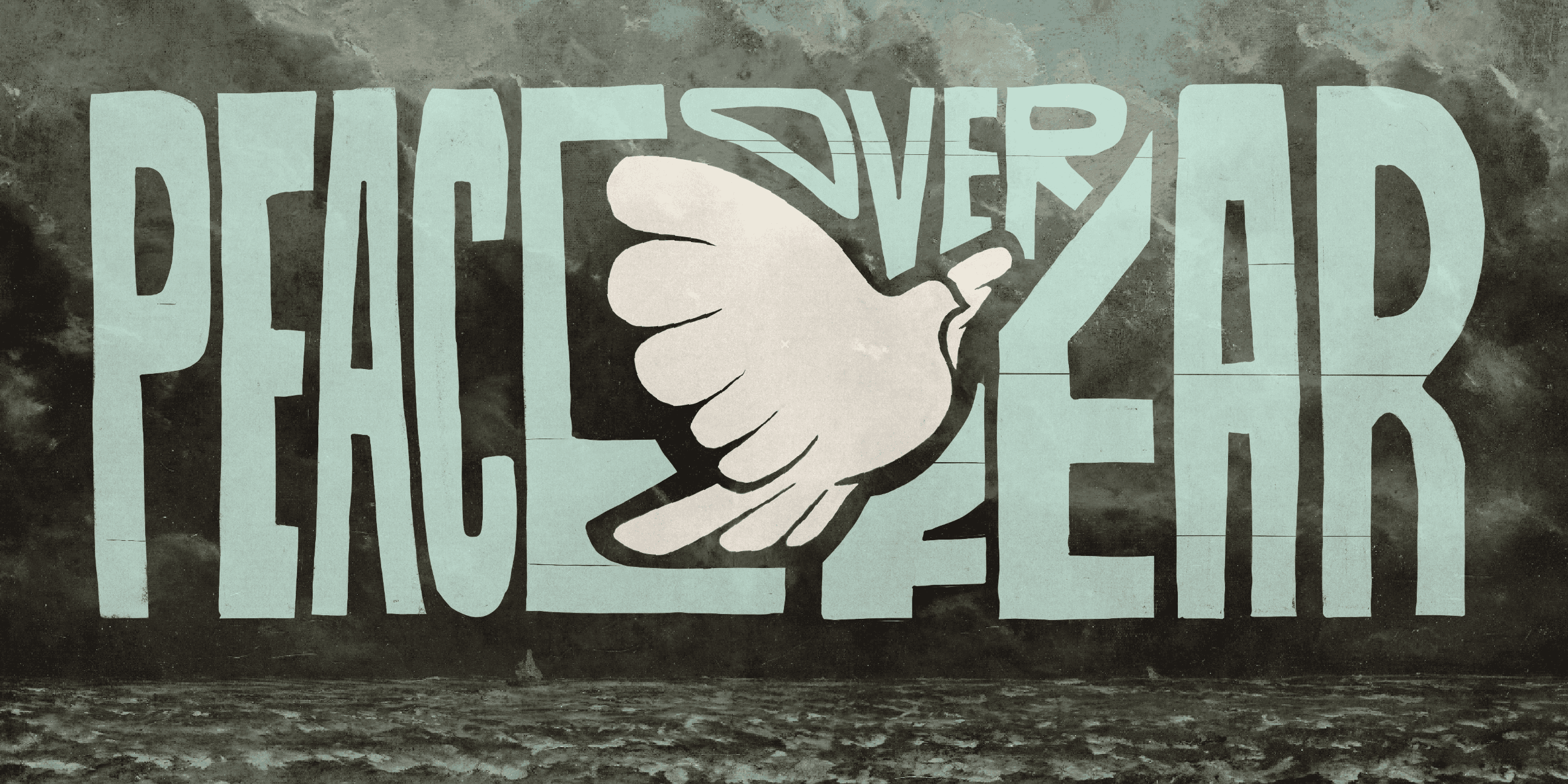
Juxtaposition was the first word that came to mind when I heard the theme for the easter weekend: "peace over fear." I decided to lean into the contrast of grim and foreboding paintings with loose illustration and typography of a dove being superimposed in a relief-print style. The mix of the two symbolizes the message that Jesus has victory over death and has brought peace in the midst of fear.


The Process
I started by curating three different mood boards that were shared in a large team creative meeting that was then distilled into one board based on the team's feedback. Upon receiving approval for the final direction I started by sketching doves. This was the most important part of the brand as it would be the centerpiece of all the visuals so I took my time experimenting and perfecting the image. Each illustration started as a sketch that was then brought into procreate to be tweaked and refined.


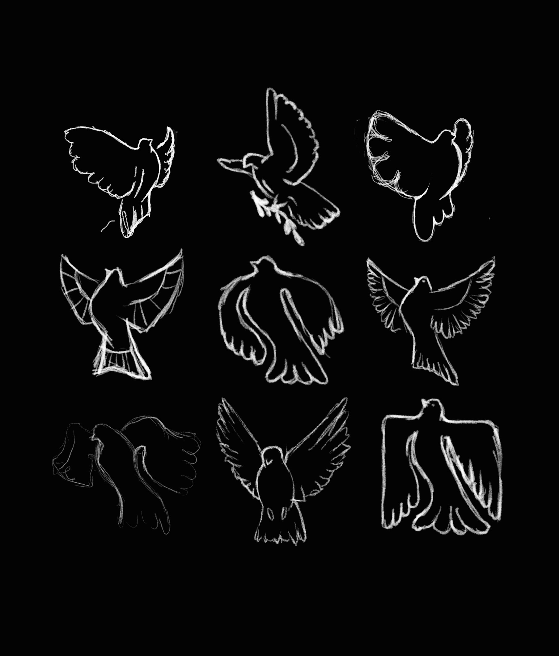
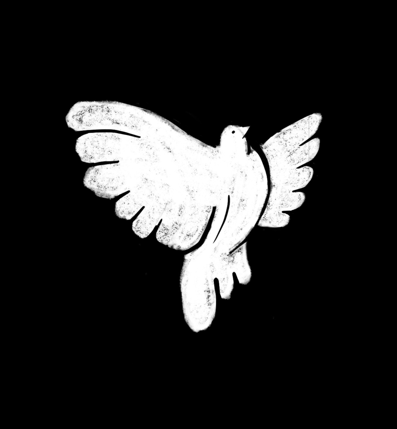
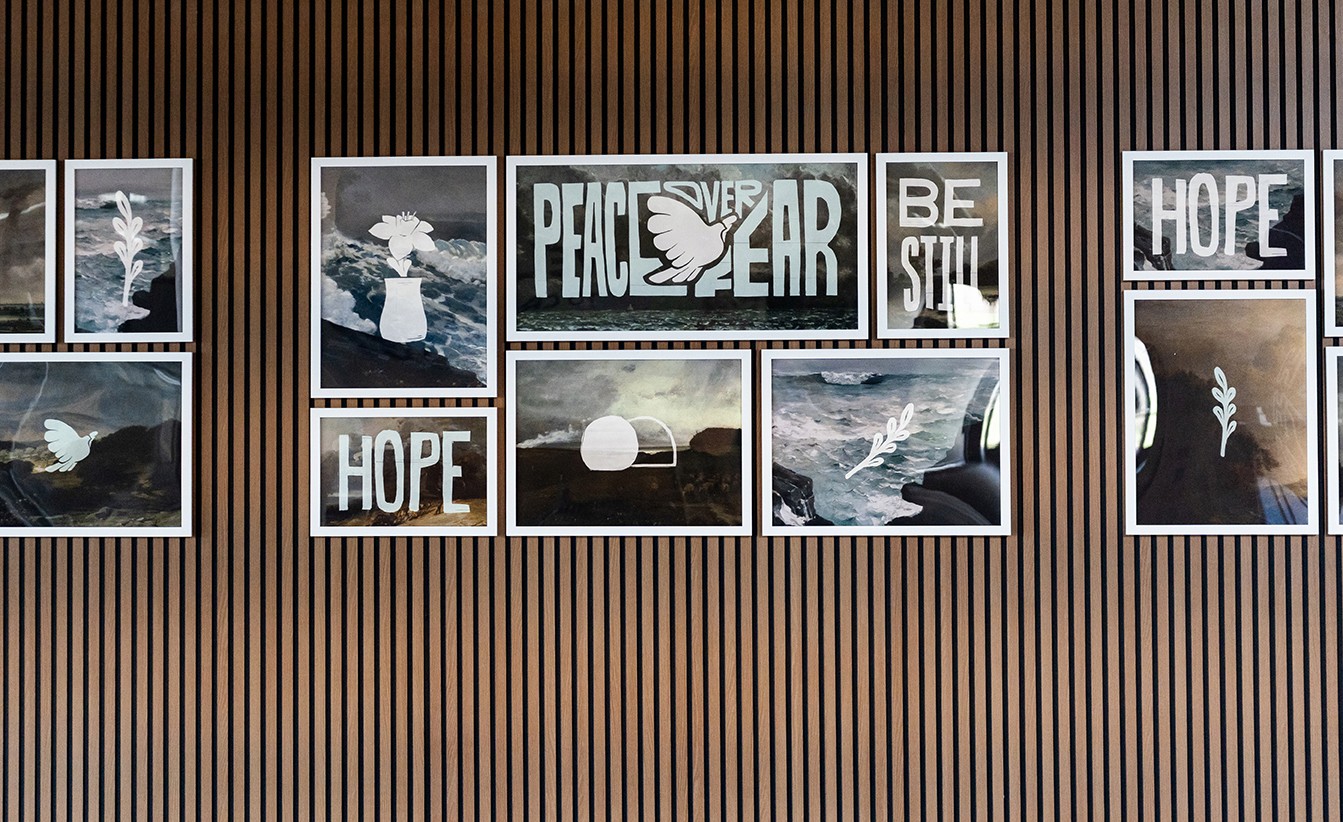
photo Wall
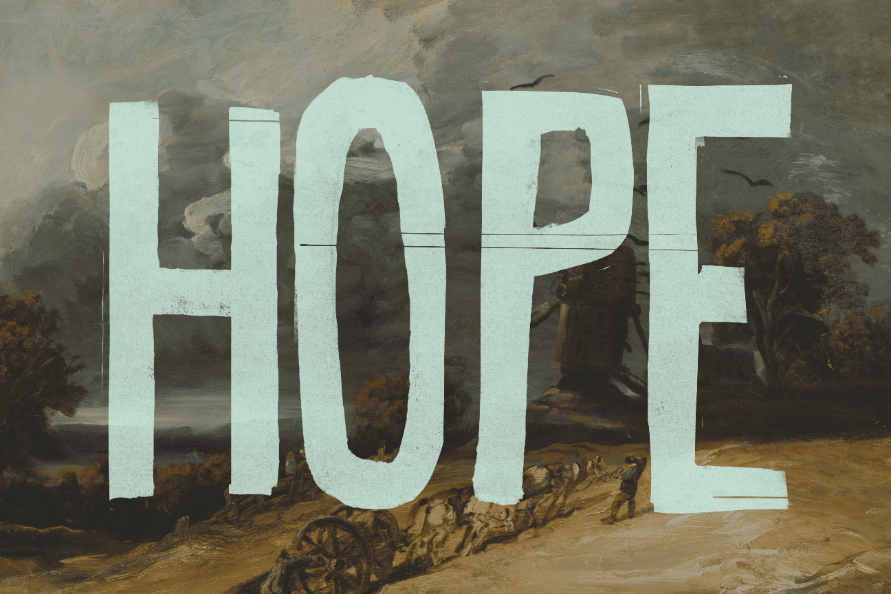
To bring the brand to life in the church lobbies, my team and I created gallery walls that doubled as photo backdrops for families. I curated a selection of paintings that were thematically linked, then made simple, but symbolic, illustrations to be layered on top. After creating the arrangement of the images for the wall, it was handed off to the facilities team for construction of the walls and hanging of the frames.